
ROTEM MORAG
A comprehensive branding project blending custom hand-drawn illustration with clean, professional graphic design. The heart of the brand is an original illustration based on an authentic moment of the client’s daughter blowing bubbles—a visual bridge between a personal story and a core therapeutic tool used in speech pathology to strengthen oral-motor skills and breath control.
Service
Branding & Visual Identity
Custom Illustration
Client
Rotem Morag Bousso
Year
2021
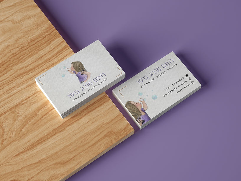
Rotem Morag Bousso is a certified developmental speech-language pathologist. The goal was to create a unique, warm, and professional visual identity that reflects her therapeutic approach.
The branding needed to convey calm, confidence, and a deep connection to the world of children, while maintaining the clean, meticulous lines expected of a para-medical professional.


THE CANCEPT
The visual identity for Rothem Morg Bosi was designed to strike a delicate balance between professional expertise and a warm, nurturing atmosphere. The central motif—a young girl blowing soap bubbles—serves as a powerful metaphor for speech therapy. In a clinical context, blowing bubbles is more than just play; it represents the foundational physical elements of communication, including breath control, lip rounding, and oral-motor skills.
Visual Language & Technique
To convey a sense of gentleness and approachability, I chose a hand-drawn, colored-pencil illustration style rather than clean, digital vectors. This textured, storybook-like aesthetic creates an immediate emotional connection with young children, evoking a sense of wonder and safety. The soft "pencil" strokes avoid harsh lines, reflecting the patient and tender care Rothem provides during her sessions.
The Balance
While the imagery is whimsical and inviting for a child’s imagination, the clean typography and thoughtful composition ensure the brand maintains a high level of professional credibility. The overall atmosphere is narrative and welcoming, speaking directly to a child’s world while signaling trust, reliability, and sophisticated expertise to parents seeking the best developmental support for their children.


SOCIAL MEDIA


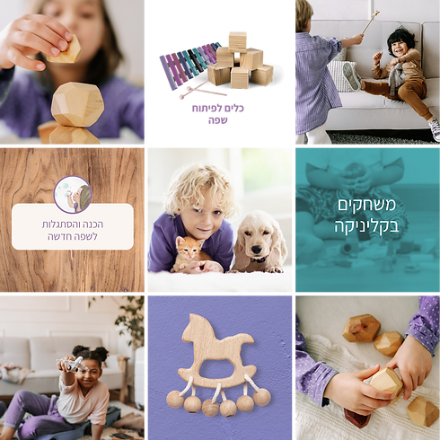

As part of a comprehensive branding project, this social media segment focuses on translating the brand's core values into an accessible digital presence. The visual language utilizes a soft pastel palette of lavender and turquoise paired with natural wood textures, creating a professional yet warm environment for parents. By integrating clean typography with lifestyle photography and "breathing" graphic elements, the design maintains a high level of legibility and visual order. This cohesive extension of the brand radiates empathy and expertise, effectively communicating Rotem’s professional value in an aesthetic and memorable way.


